-
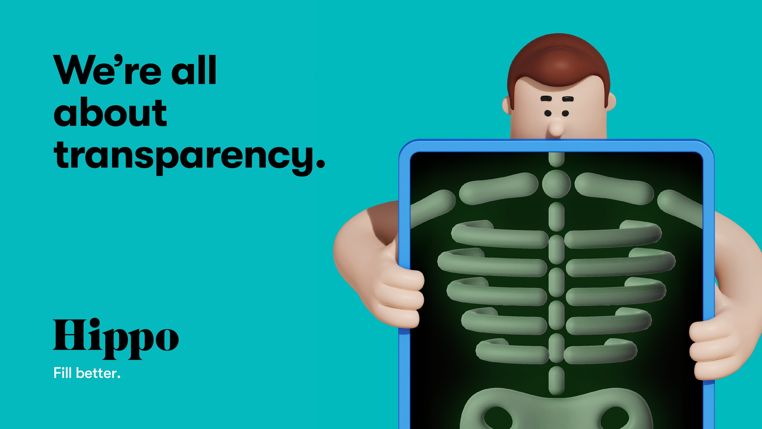
The healthcare industry and prescription management process in America is complicated and frustrating. From a lack of transparency in drug prices to unpleasant pharmacy interactions, the process is disorganized and highly inconvenient. Hippo’s goal was to change just that. The team at Hippo wanted to disrupt the sterile space of healthcare technology with a bold & fun identity that launches the brand as the one simple destination to Fill Better.
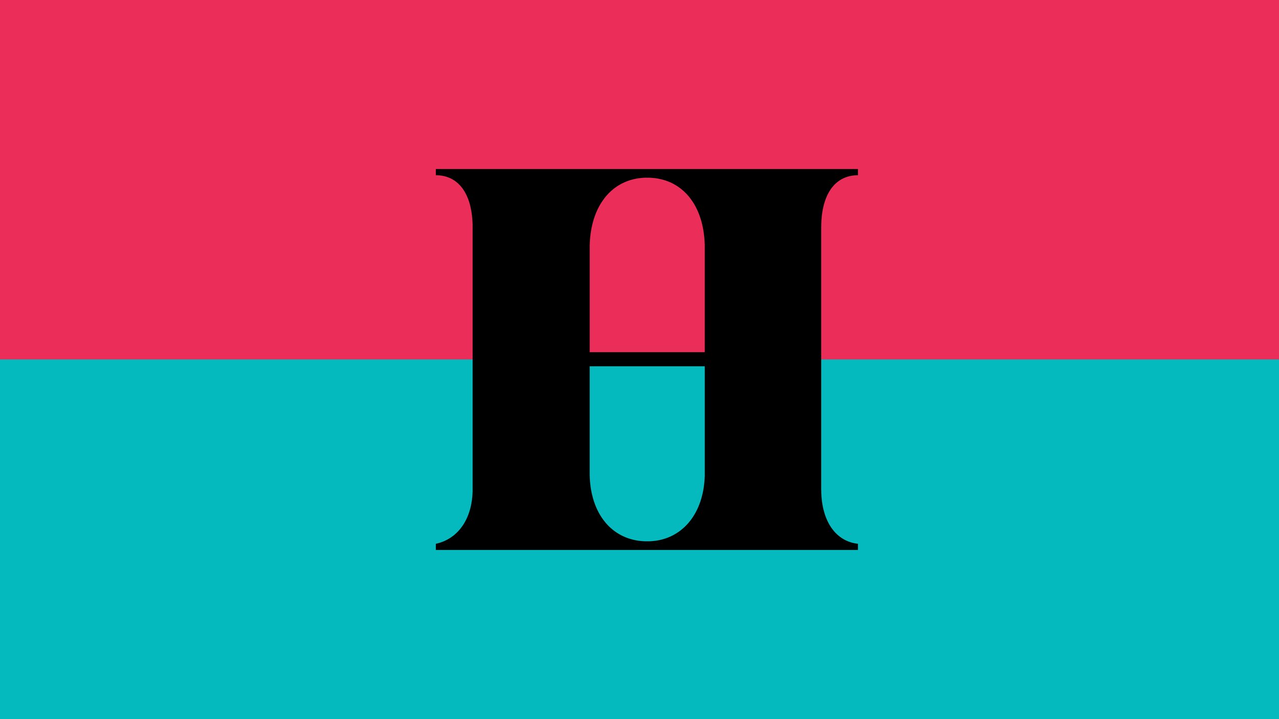
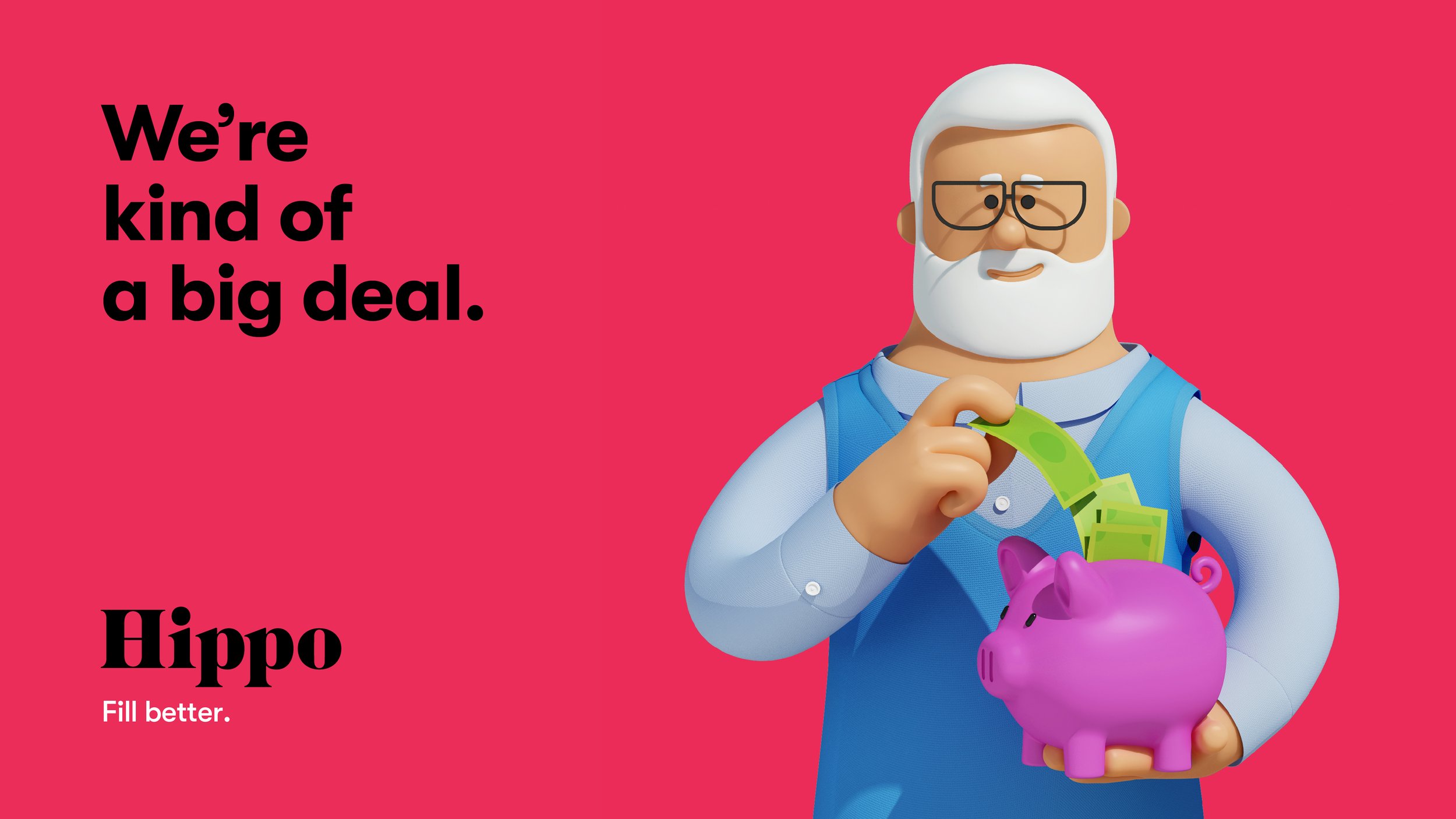
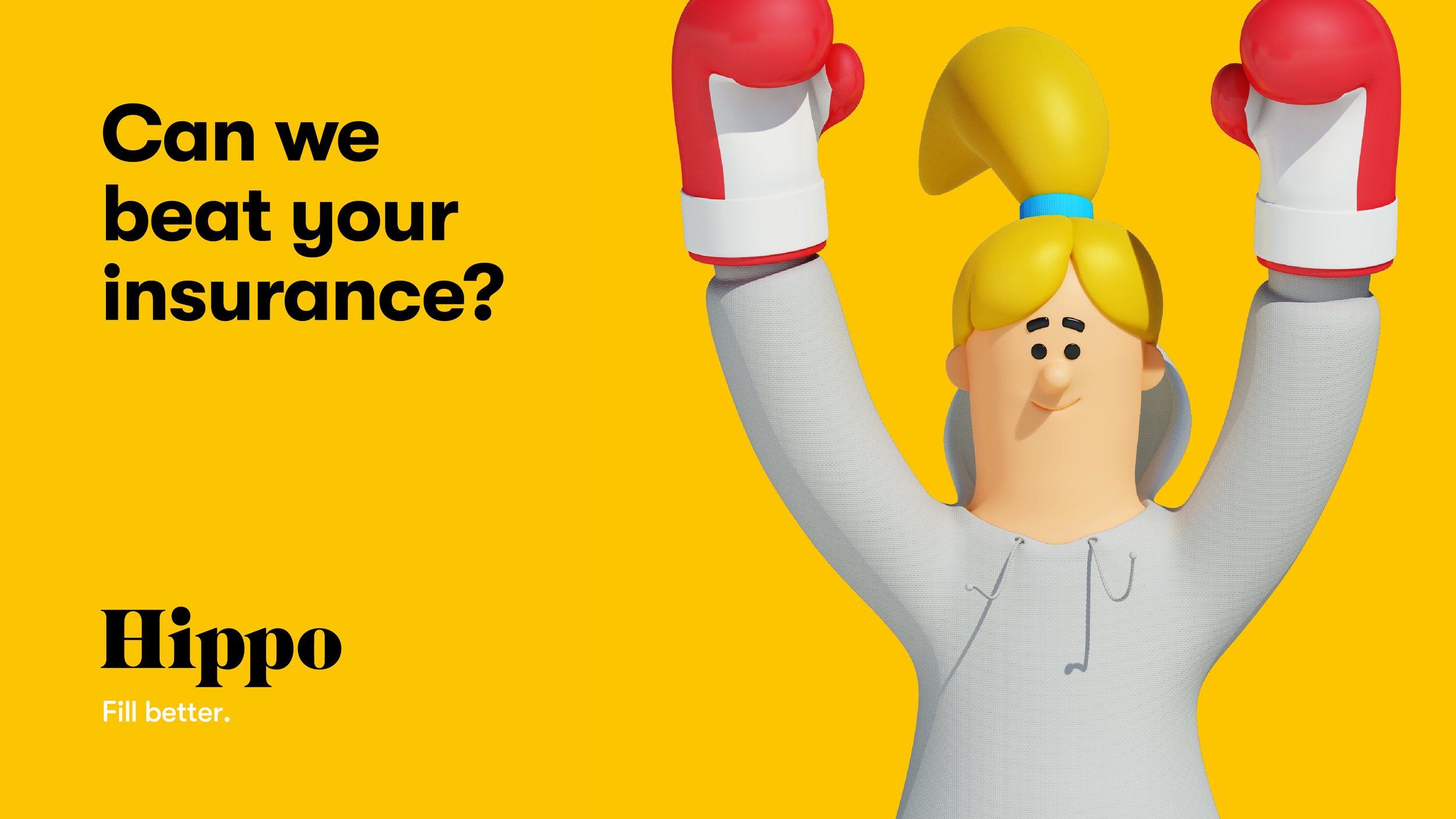
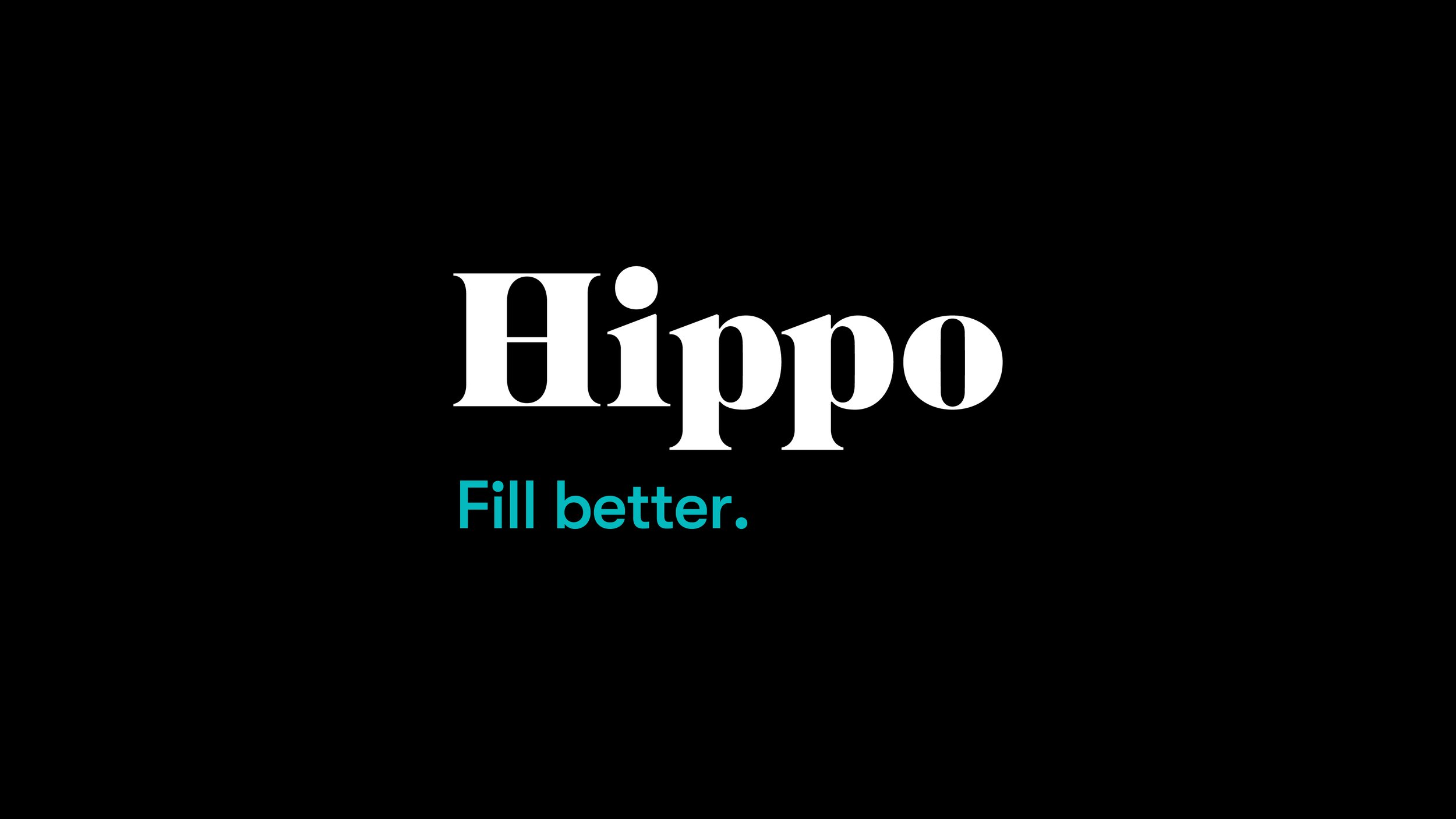
We created a visual identity system that brings to life what the brand is truly setting out to do — disrupt a complicated industry with honesty and a spirit of playfulness. The custom-crafted logo that cleverly employs serifs to embed a pill, representing the entire brand, forms the foundation of a vibrant system. From the catchy and playful name, to the bright & vibrant color palette married with an approachable sans serif typeface — the identity is bold, confident and full of fun. A witty yet informative tone-of-voice and the bespoke 3D illustrated characters infuse energy and dynamism to allow the brand to stay true to itself and the consumers.
-
agency .. Jones Knowles Ritchie
design .. Tosh Hall, Robert Medkeff, Cyrus Blais, Jennifer Yung, Catherine Wyatt, CJ Draper, Izgi Yapici
strategy and verbal .. Willie Miesmer
illustration .. Jean-Pierre Le Roux
-
Clio Awards .. Brand Design .. Silver Winner .. 2018
Communication Arts .. Identity Program Design .. Award of Excellence .. 2018
Graphis .. Branding .. Silver Award .. 2018
Graphis .. Logo .. Merit Award .. 2018
The One Show .. Branding .. Silver Pencil .. 2018